Okay, there’s bound to be some reading this who will no doubt ask,
“What about the Rule of Thirds?”
This is just my opinion, but when you attach the word “rule” to photography, it ruins the whole experience.
After all… my viewfinder doesn’t have a grid or lines.
If I were a sniper you can bet it would.
But I take photographs.
Why would I need such precision and be locked into 3 columns and 3 rows?
This is art. Fun stuff.
The Eyes–In this situation, as with most portraits, the eyes should be the center of attention but should they be in the center literally?
Instead, I think it’s more important we understand how our eyes see objects in a 2- dimensional space.
If Uncle Sam can finance research on projects that bear little or no use to us with little monetary gain, then you can bet the scanning pattern of human eyes is something that has been studied very, very extensively.
 It’s this kind of research that the print and retail industry pay very close attention to.
Supermarkets, grocery stores and other convenience stores understand this and tailor their product placement accordingly.
Their interior color schemes, height of shelves and so on are carefully picked based on a lot of these studies on how our eyes see.
The online marketeers are even more in tune with these strategies.
I’m sure they have it down exactly how and why certain ads on webpages do better than others.
I don’t need to be telling you why this is important to you the photographer, do I?
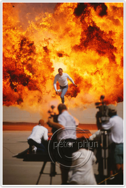
Striking image–I didn’t set this one up. It was part of a pyrotechnics display at San Bernardino International Airport. The media was invited to this display. So what has this to do with how our eyes see? Read on about Color Saturation.
Anytime you hold that camera up to your eye and you compose your picture, you are in the act of communicating something to someone.
Doesn’t matter if you’re just doing as landscape.
Good old Ansel Adams said There are always two people in every picture: the photographer and the viewer.
So you ought to tell your viewer what your subject is. Please don’t make it a game.
Here are some of my suggestions:
Make the subject humongous.
 Making your subject BIG is like slapping the viewer on the back of their head and saying, “Psst..I’m over here.”
I’m the subject. I’m important.”
There’s no subtlety here.
I’m not saying every subject you take needs to be big and dominant in the viewfinder.
It really depends on how big the final image is going to be displayed.
 Just keep in mind that great picture you see on a billboard won’t have the same impact as something in print that runs the width of 3 columns in a newspaper, or worse, on a webpage.
So when in doubt, compose to make your subject BIG.
Same Butterfly–The wide shot of the butterfly is good but when it’s tight, the image is instantly more arresting.
It minimizes the likelihood that something else in the picture will compete for your viewer’s attention.
Also bear in mind, when I say “BIG” I mean your subject should be composed so that it’s the biggest most dominant object relative to the other objects.
Use Contrast
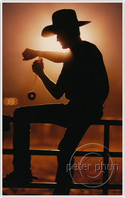 Our eyes are drawn by extremes of light and dark.
Silhouettes are extremes of contrast, usually with only 2 colors. They grab your attention because they are so stark.
I teach my students how to shoot silhouettes because it is a great device to focus attention with very little fancy know-how.
Contrast, by the way, doesn’t need to be in light and dark. That’s the literal meaning.
Think in terms of size as well.
We’ve all seen the tight picture of just dad’s gigantic hand holding his little newborn’s hand.
Though its appeal is something all humans can universally relate to, it is actually a tale of contrasts in size, isn’t it?
Use Saturated Colors
This next suggestion applies to color photography mostly.
Since our eyes see color, the more saturated or rich and deep the hues, the more our attention is drawn to it.
If you are in a position to set up a photograph and it’s to be shot in color, this is a good technique to keep in mind.
Even though I didn’t set up the picture of the pyrotechnics display, the color of the flames surely illustrate how our eyes are drawn to it.
Use Shapes as Frames
As kid in school, I daydreamed a lot.
I’d look up skywards whenever a plane flew overhead.
I always picked a seat where I could look outside the window.
Suffered the wrath of many a teacher as a result.
See where this is headed?
Even back then I must have thought images need a matte, frame or border around it.
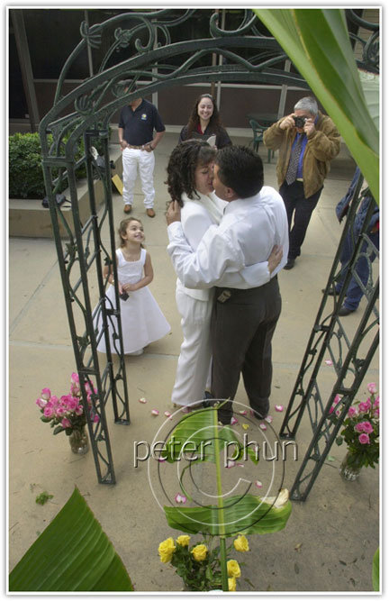
Using frames–This civil marriage ceremony was really no fuss or frills but I was thankful I at least had this trellis to work with. That and the banana leaves made this situation salvageable. Too bad the man in the background wasn’t paying much attention to the proceedings. I decided since I couldn’t interrupt to get him out of the picture, I moved a few inches so his face is obscured by the trellis.
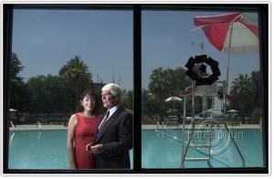
See the picture below of Congressman Jerry Lewis and his wife.
I had to come up with an idea quickly of how to photograph them.
I went inside the building and used that window frame from my childhood to frame them as they stood outside. A flash triggered by radio remote on the left outside the building did the rest.
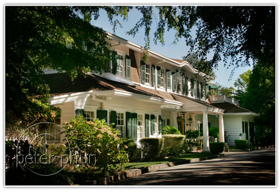
When you’ve found your frame, place your subject within.
Sometimes it doesn’t even have to be something solid.
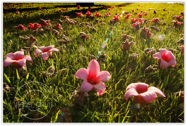
It can just be shadows or leaves like this picture taken in Redlands, California for Inland Empire magazine.
Rule of Thirds
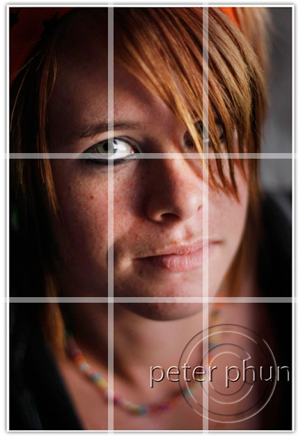 I guess I better address this Rule of Thirds since I raised it.
Picture a grid of 3 columns by 3 rows that’s superimposed in your viewfinder.
When composing, you should place your center of interest not smack in the middle, but at the intersection of the lines.
Just because I use the term the center of interest, you don’t have to take things literally.
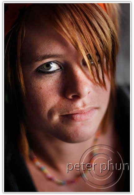
In this portrait of my student Chayne, eeny, meeny, miny, moe, where should I place her eye?
Notice her far eye is not the “center of interest” since it’s partially obscured by her playful but very cute hair.
Now what happens when placement of my subject at that intersection of those vertical and horizontal lines doesn’t work? I suppose you could shoot even tighter. I dunno.
Like my inability to name my child before seeing their face, I have to see your picture before I can suggest how to compose your picture for you?
I must have lucked out with the portrait of Chayne!
You’re welcome to disagree naturally.
If this post is helpful, please share this with your friends and family.
Grabbed your rss feed. You have a good thing going here.
And good response as well to my answer.
I use lightroom, but I find that scans of analogs are sometimes harder to tweak than digital. And often It just gets worse 😀
well.. there was a photo marathon earlier this year in copenhagen, and it was not allowed to return analog shots, even though It was possible for me to do in the allowed timeframe.
what the f*** ?? Suddenly digital cropfactor BS is the king ?? I am stunned. There response was that It was easier for them with digital. LOL… so.. quality is not important anymore ??
We seem to live in a world where cheap and fast is the answer to everything. Im not that old even though im getting a bit angry bitter, so im not saying this just to be against everything. Im saying It because maybe we are some of the things that make humans so special. Our ability to wait and struggle for a result. Out passion for perfection. The importance of play.
Gotta run… Give me some thoughts on this subject.
Your knowledge astounds me, especially when I see you work in person.
Hello Brian,
Thanks for visiting my blog and taking the time to leave your comment.
It is art after all.
I find altering the lighting and intentionally underexposing a scene to get saturation and so on is actually okay. You’re making an artistic interpretation of what you saw.
The direction digital photography is heading that I feel is a becoming too much of a perversion is an over-dependence on photoshop to correct or compensate for laziness.
The most egregious form of this if there is a distraction in the background which should have been caught during picture-taking.
Laziness and sloppiness go hand in hand there. Once you start saying oh…I’ll clone it out in post, you’re heading towards that perversion.
Flash is a tool which photographers need. Many times that’s the only way to control the contrast in a scene especially when there are issues like depth of field that you need.
Sometimes there can be no other way. Not everything lends itself to be shot only in available light. You might be able to do that with landscapes, but not where there is people and movement.
nice article. and I guess it points out that rules are there to be broken.
I think when It comes to what works and doesnt work, It also depends on the audience.
Vivid colors are not always a good thing. With digital… yes.. but with film Its sometimes just best to let the film do Its thing. The real world is not always in strong colors. But maybe im just strange. I even consider flash a perversion, because its NOT natural light.
Nice shot of Jerry Lewis and his wife though 🙂
Hello Tom,
Thank you for reading and taking the time to comment. It’s kind of nice to see folks stopping by on old posts.
I just don’t like the term “rule” when it comes to photography. It stifles and formalizes what should be a gut feeling.
As I said, I think it more important if you understand how humans scan and what catches the eye.
It took me along time to really be sold on the rule of thirds, or ROT as I like to call it. Things have to make sense to me before I can readily accept them. I struggled with rot for many years. Why not put the main subject in the middle? After all, they don’t call it the main subject for nothing right?
I was really pondering this one day, I was pretty well convinced that this whole ROT thing was well, off centered if you pardon the pun. As I sat and thought about the ROT, I happened to glance at something on my desk. I looked away, still deep in thought. Then something started to stir, just a little at first. Then suddenly, I looked back up at the object on my desk. It was not in the center of my field of view, in fact, it was off set approximately one third from the center. Wow! It’s ROT.
WHAM!!! It hit me like a linebacker at full speed! When we compose a shot and capture the image. We want that image to be as natural as possible. Rarely do we look at anything in our word and it is right smack dab in the center. Unless it has 18 wheels a big loud horn and it is headed right for us! Most of the time, any given scene in our field of view will somewhat conform to ROT. We want our captured images to look as natural as possible. So we use the Rule Of Thirds. The finished result looks like a window to the word.
And that is not so rotten after all. :o)
Well I now unerstand the rule of thirds….it will be hard to break the habit of centering the shot….
Hello Francisco,
Thank you for your comment. I’m glad to see someone’s checking their email. 🙂
I’ll see you in class.
Hi Peter:
I’m one of your new students at RCC (Rubidoux). Nice post:
{“If I were a sniper you can bet it would.”}
That’s very funny 🙂
That picture of the senator Congressman Jerry Lewis and his wife is just great. That one, shows that you need not only a good camera to get great a picture but you need to think fast and be smart as well.
I had the chance to develop black and white films, and I can tell that It was an amazing experience to watch images showing up from nothing just upon your eyes. I guess that magic is disappearing with the new digital era, but, on the other hand, It’s easier now to preview our pictures. I guess the Art of photography is still there.
Anyway, It seems that we’re gonna learn a lot here.
Best Regards
Francisco.
Hi Cindy,
What a pleasant surprise! Please say hello to Doug for me. If you need help with the classroom blog, I highly recommend the WordPress platform. Free and fairly easy to do especially if you don’t need a self-hosted version. Contact me if you need help.
Hi Peter,
Enjoyed stumbling on this after linking from a layoff list of PE casualties. Enjoyed your read and think it’s great to see your how-to. P.S. I’m now teaching 5th gr in Fresno. Hope to get a classroom blog going this year! Take care, Cindy
Christina,
Getting a picture out of a camera exactly the way your eyes see it is actually a lot trickier than most people can imagine.
For one thing, it takes practice. Most cameras on automatic can do that. But to successfully get predictable results time and time again, that requires more skill and familiarity with your particular camera.
Just as there are no shortcuts to learning how to design a brochure, you can’t expect to use the same formula to suit every situation. If you do, all your pictures will start to look the same. Like your brochures. They’ll all be tri-fold or 3 columns etc.
So it may be useful for you to send me a picture that you took and I can post it on here and I can see what you’re talking about.
The camera renders the brightness and exposure based on what settings you choose. It’s mindless and can’t think for you. It only gives it’s best guess especially on fully automatic or program mode. So you, the operator, needs to know what you want, then figure out how to tell the camera what you want it to do.
In answer to your question about outfits. Think of it in terms of design as well.
Your subjects’ faces are the center of interest. When you create a design around a product, you want to keep the background, the colors from distracting from your product.
So when planning a family portrait, keep things simple. If it’s an entire family, have everyone dress in the same hues and colors. No multicolors and absolutely no stripes and distracting patterns or logos in the apparel.
You want to emphasize the faces. I alway suggest clients dress alike. Turtle necks and dark pants or outfits. Longsleeves are good in those situations. They can help cover unattractive skin flaws and help de-emphasize heavy set individuals. The more bodies in the pictures, the more the likelihood that they’ll be more of these sorts of distracting elements.
Keep jewelry to a minimum in group shots too.
Hi Peter,
Sorry for not being too specific. There are times when you take a photo it darkens some parts of the background, i would like to take a photo just the way i see it, lighting and everything, sharpness as if the people, place or thing is actually there in front of you as you look at the photo, does that make sense?
As for my second question, is it possible to be a good photographer if he/she doesn’t know what outfit would look good for a photo shoot, let’s say for a family portrait, engagement not necessarily for a fashion shoot.
thanks!
christina
Christina,
In answer to your 1st question, I’m afraid you’ll need to be more specific. Perfect lighting depends on too many things. Different subjects have to be lit in different ways. Sharpness is not necessarily desired depending on your subject. If you have a closeup of say an older anchor person on tv, she might not want all that sharpness. All the flaws in her complexion will show.
Vibrant colors depending on where it is and whether it’s on your center of interest can distract from your center of interest.
As to your 2nd question, I don’t quite understand it. Do you mean you are having problems with a photographer? That he/she can’t tell what outfit as in clothes will look good in photos?
I think you have to be more specific here. What is your subject? What are you trying to portray? What do you mean by outfit? Is it a fashion shoot? What is the picture for?
I think you’ll need to be more specific.
Hi Peter!
I would like to know how to take a picture with perfect lighting, very sharp and with vibrant colors! Is that all done in photoshop? And is it possible for a good photographer not to know what outfit would look good in photos?
Thanks!
christina
Jina,
Have a great trip. Looking forward to seeing your pictures from the trip. Thanks so much for reading and taking the trouble to leave a comment.
Wanda,
Very kind of you to visit and comment. Your BW images of the city arouse my wanderlust. I’ve not seen enough of the east coast, some day…
“Terima Kasih†or Thank You (that’s in Malay or Indonesian language Bahasa). Literally, it means ‘accept my love’
I always enjoy reading this blog because it keeps things fresh in my mind that I otherwise might forget. It keeps me continually asking “How can I make my photos better?” This article was especially informative for me and will help me on my upcoming photographic road trip to take the best pictures I could possibly take!
Today’s is an excellent article, as always, and it more than makes up for the password-protected post yesterday. 🙂